
Searching some display bugs on distrochooser.de
Some display issues needed attention
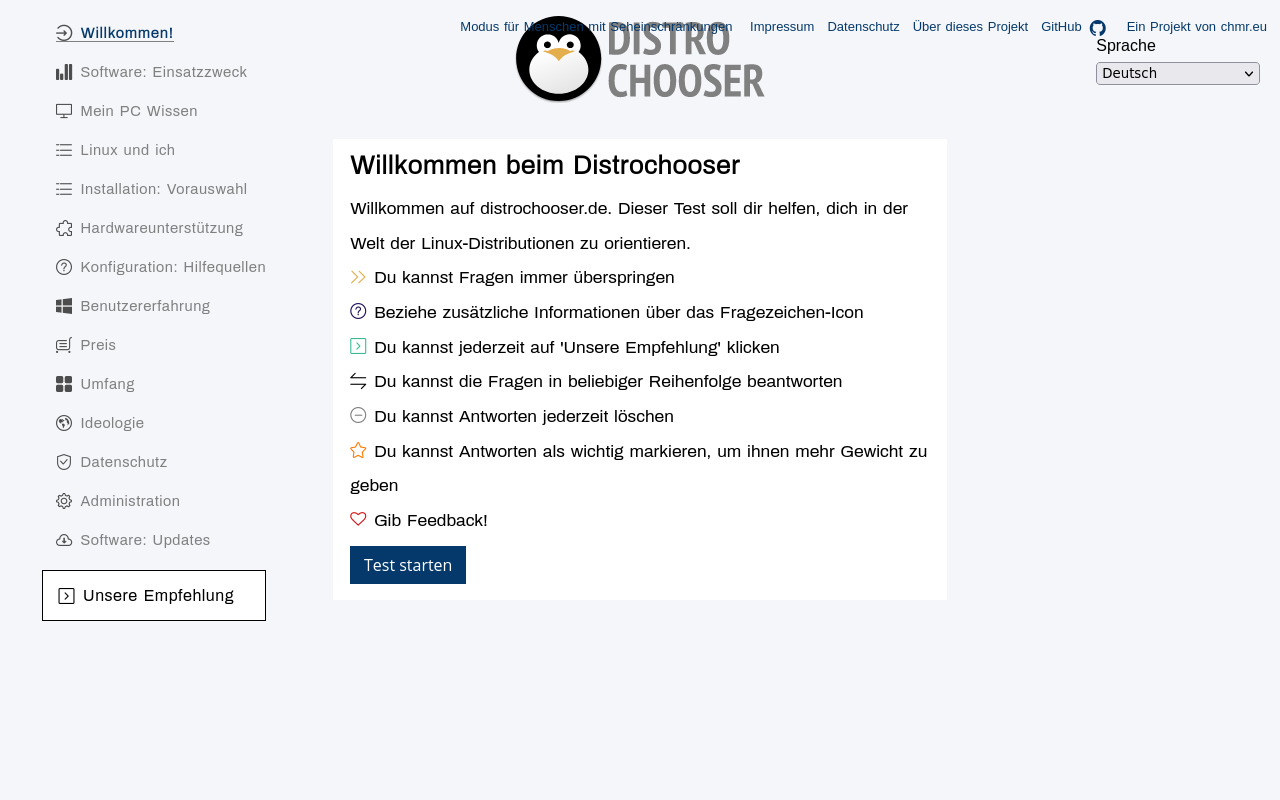
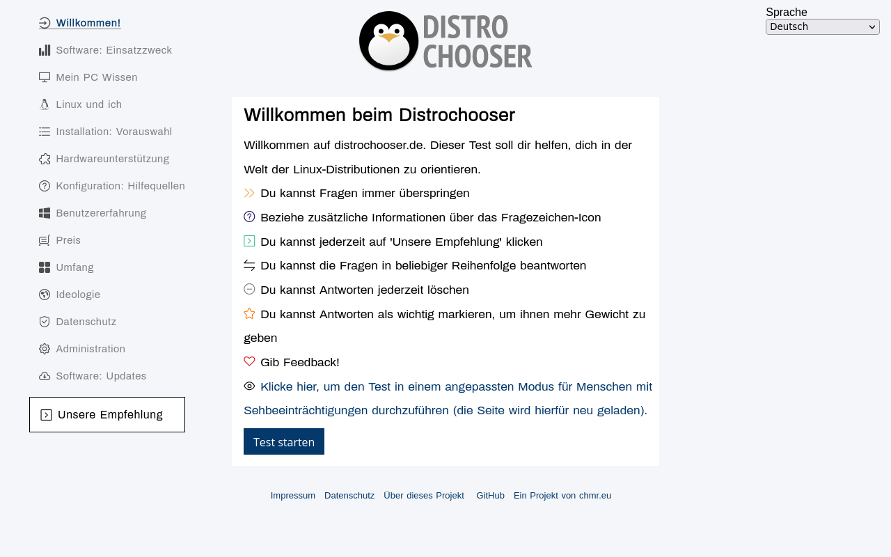
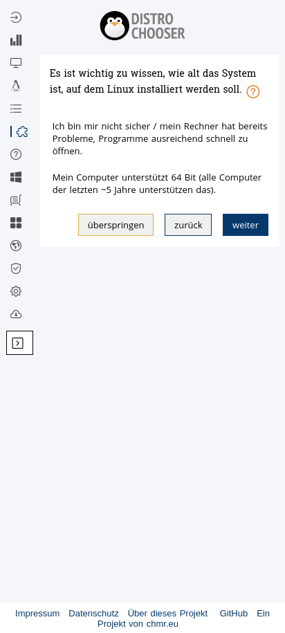
Today, I worked on some display issues on distrochooser.de.
I focused on the footer, the language select and some additions regarding the visually impaired mode.
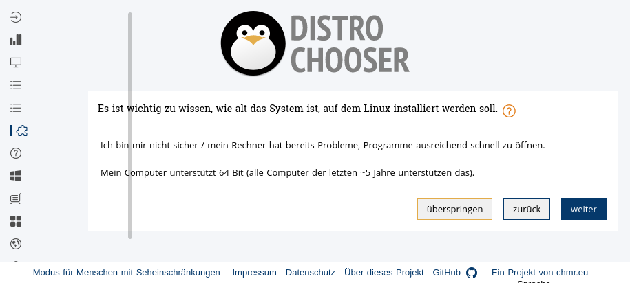
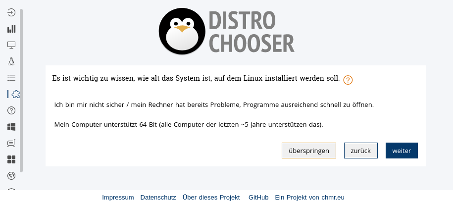
The footer (which was named footer, but was positioned on the top.. le me=genius..) was pulled back down to prevent the overflow on MDPI screens. Additionally, the footer was reduced in it's content and the entry link for the visually impaired link was pulled into the welcome text to make it more present.
On mobile, I fixed an overflow on the "our recommendation" button (might still occur on some display sizes as more classes will be required for that). Distrochooser 5 does not use a CSS framework as a basis, so there are more extra steps to go here to support all major sizing classes.
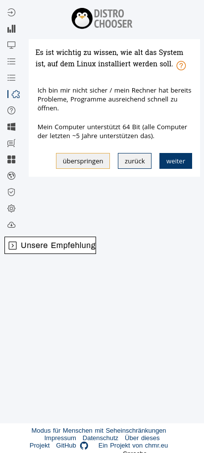
The margin between the navigation and the question text was reduced if the phone is used in landscape mode.
Changes in behavior
Even as the codebase allows it, I decided to hide the language select after the welcome screen. Why? It's always in the way.

I don't want to add show-hide-toggle patterns as they are even harder to translate into other display modes (such as the visually impaired mode, where space is even more limited).
And from the logic, I think the user should have selected the language when starting the test.
Photo by Tom Arrowsmith on Unsplash
Gif https://giphy.com/gifs/splat-nicksplat-angry-beaver-xUNd9LFLm8sxDOs9lC